Primitive
Button
Auto-emitted from DSKintsugiCatalog.button. Tier atom.
Live Preview
Themed button matrix
.ds-cta-primary
Themed accent bg · gold halo on hover
rest
hover
pressed
disabled
.ds-cta-secondary
Transparent hairline · gold halo on hover
rest
hover
pressed
disabled
.ds-cta-secondary-red
Carmine accent · use for destructive actions
rest
hover
pressed
disabled
Native · macOS
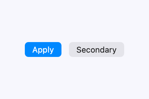
DSL usage
// KatagamiCore ViewNode tree — single source of truth
ViewNode.button(
    label: .text("Apply", style: .body),
    action: .submit,
    style: ButtonStyle(variant: .primary)
)

// SwiftUI consumption (renders via KatagamiSwiftUI):
Button("Apply") {
    viewModel.applyFilters()
}
.buttonStyle(.primary)

// Web emit (this storybook page is the proof):
<button class="ds-cta-btn ds-cta-primary">Apply</button>
Attributes
| Name | Type | Default | Description |
|---|---|---|---|
label |
String | |
Button label text |
style |
ButtonStyle | primary |
primary | secondary | ghost |
action |
() -> Void | |
Closure executed on tap |
density |
Density | regular |
compact | regular | expanded |
locale |
Locale | en |
BCP-47 locale tag for locale-aware rendering |
Used in
FundsScreener